Sunday, January 29, 2012

Exercise 2: Concept to conception in public space

Schiebroek-Zuid Project Greens; Rotterdam, Netherlands; Except Consult
View of Central Markets
Another currently ongoing project by Except Consult is the Schiebroek-Zuid Project Greens. This project converted a Post-war social housing area in Rotterdam (Netherlands)  into a sustainable housing template with methods of providing biological means to provide water, electricity, heat, and food suitable for this temperate climate and Dutch culture.  They use proven “green” technologies and approach the situation in an effort to address socio-economic problems in the area and project almost full energy self-sufficiency by around 2033.


The design process:
http://www.except.nl/design/Schiebroek-Zuid/index.html
The site was studied and assessed as to what the existing conditions could provide for inspiration. the existing architecture and site use was taken into consideration. This site is an urban housing area of about 8 full city blocks, much of the space was rather underutilized.
Options for a closed-loop system dealing with energy, food, and water needs were considered and matched to the particulars of the site conditions. This project is hoped to influence future urban renewal designs in the light of our changing environmental issues.
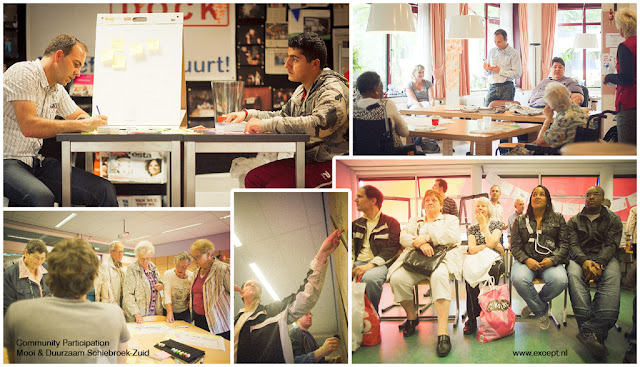

The next step in the process for this project was a community charrette held to get the impression of the people living in the area.  This part of the process involved both the stakeholders and residents and was commissioned by Vestia (housing corporation), and InnovatieNetwerk (agricultural non-governmental organization). This step is very important since the project is centered around what the community needs and wants for public space, so discussions and open concept drawing sessions added valuable input.               
 Ignoring the fact that the text in the images are in Dutch, these have been compiled by the design group in response to the community charrette.  At this point the designers were able to find out what was important and could refine them down to a working program or list of needed elements.

Future projection, system flow diagrams, and conceptualization:
From the concept sketches and program a set of goals was drawn up and diagrams looking at how they could be achieved through different processes. This trajectory diagram is looking at how past energy uses and fuel price and availability can be used to project into the future, showing a point where they merge and balance out showing how the community can become self-sufficient.


Symbiosis in Development

By using Symbiosis in Development (SiD) process in their design and planning, the group can address this complex and multi-faceted problem to come up with a holistic system solution.  This effort created a kit-of-parts that can be mixed and matched to solve any set of problems or needs over time to achieve design goals.  Since this addresses ecological, social, and political problems from a multitude of angles and approaches including “green” solutions that have been proven effective, they are able to make feasible long term projections and planning design goals.
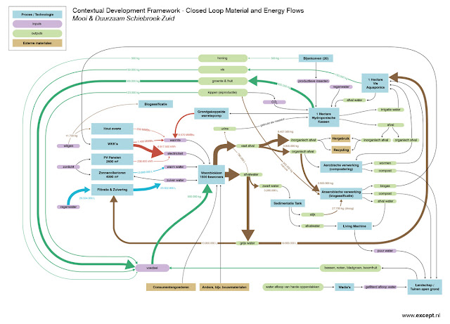


The materials and energy flow diagram helps to illustrate how everything would work in the site. Everything is considered and they attempt to limit the amount of inputs and outputs of materials on site.  Social programs designed for people of many backgrounds and ages, primarily ones currently found in the community, and other local business and activity incentives. Solar energy, passive heat capture, biogass systems, edible landscaping, water systems, and the re-use of the existing buildings to limit the amount of ecological and human disruption.   The new structures will be incorporated with the standing buildings where they would work best.
Other diagrams include system diagrams such as this water flow diagram focusing on recovery and re-use,
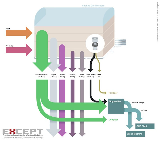
and a waste flow diagram depicting the input and output cycles, focusing on minimizing outsourced waste.

Proposed Master Plan
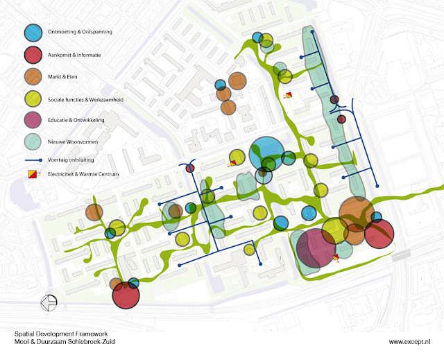
This master design plan shows where residential areas, the marketplace, community center, and flexible workshops are within the site.  Since communication and flow through the site are important, public green spaces connects the existing homes and the elements within the design program. Expanses of previously unused lawns are replaced with edible landscaping (potentially  up to 70% of needed food production) and residential public space.
 
Many parts of this design are currently being implemented by the contractor and the design images certainly gives a cohesive, not futuristic per-say (more utopian), but an efficient and self-contained impression.  It looks like a close cooperation and co-habitation of humans and the systems they need to be self-sufficient.

Proposed views and site uses: (http://www.except.nl/design/Schiebroek-Zuid/index.html)
View of Water Park
View of Pedestrian Corridor
View of Metro Plaza
Another View of Water Park
View of Water Houses


Friday, January 27, 2012

Exercise 1 reflections

This is the San Francisco Transbay Terminal Environmental systems diagram by Except Consult for the TJPA competition in 2007.  This diagram shows how stormwater is collected and re-used and how the system and the presence of the trees deals with the heat produced by the vehicles. I found this diagram to be clear yet informative about a very complex system, and the way it is organized and rendered is very compelling.  I find the combination of the semi-realistic exploded axon and basic labels and sub-diagrams to be quite successful.  Since this drawing was not labeled as such, I think it was made with Photoshop and Illustrator, since it is so crisp and precise it may have been drawn on top of an AutoCAD drawing.  From this I learned that I can combine diagrams without making them too busy, and express a system not just as a flat flow diagram but also in a 3-dimensional manner to show how the system will operate in real space.


Shanghai Carpet Master Plan
Tom Leader Studio and Skidmore, Owings & Merrill LLP. 2006

This is the plan for a plaza at the Shanghai Yang Pu University City Hub. The colored stripes are made up of a large palette of materials and textures that help reflect the history of the site.

It is hard to render realistic master plans in a way that does not feel too dark, flat, heavy, or busy.  There is so much information that goes into one and is seen from a perspective that most people usually don't see.  I think this one works.  The area that is the proposed design is more defined than the existing surroundings yet does not contrast too much and seems part of it.  everything is simplified but recognizable enough to know what it is without labels cluttering it up, you can also get a feel for how the space interacts with the buildings.  

I would guess this piece was drawn in AutoCAD and exported into Illustrator with swatches and trees drawn in Photoshop then brought over into the image.


Section showing relationship between Pier 4, Brooklyn Queens Expressway, Landform, and stone beach;
Brooklyn Bridge Park;  Michael Van Valkenburgh Associates, 2005
I find this section to be more interesting than the standard flat cut-through ones since not only can you see the vertical spatial relationships that you find in a section, but also how the horizontal works with it.  I can actually see myself in this space so I think it is successful.  The trees are also transparent enough not to block or detract from the image. The text also does not distract from the image as much as it should which is good since this shows an expanse of space that needs labels to help define what is there.  
This seems to have been done in Photoshop and Illustrator as well, perhaps on top of an AutoCAD section for accuracy.


Parc De La Cour Maroc Perspective of Terraces; Paris, France
Michel and Claire Corajoud & ADR and Georges Descombes, 2006
How realistic should you make a perspective? If it is too realistic people seem to automatically have a reaction of like or dislike, but if it is abstracted slightly or things that are ephemeral are shown as such then people tend to look at it longer and really think about it rather than following a first impression.  The landscape looks realistic yet obviously put together so you know this is a image proposal not a photo after completion.  The people within the site show how it can be used yet they are not permanent installations so they are B$W and faded out slightly. This makes the identity of the people not as important as their presence and interaction, they work better for the image than a solid silhouette would too. 
My current approach to creating perspectives is to make them as photo-realistic as possible, but this seems to be more successful in some ways.  This was definitely created in Photoshop, possibly on top of an existing image.