Welcome to the 4th phase of this assignment!
For this part we had to put together a "portfolio" of the images we have worked on so far using a combination of the different computer programs we have looked at in class.
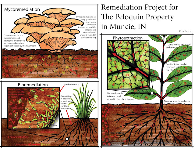 |
| Cover/First Page |
Ok, to set up the project and quickly introduce the important processes behind what I am working on the site: three of the biological remediation techniques. This page was organized in InDesign, but the individual diagrams were hand drawn, assembled in Photoshop, and then the arrows shapes and text were added in Illustrator.
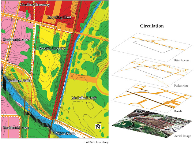 |
| Page 2, 1 of a 2 page spread |
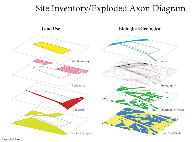 |
| Page 3, 2 of a 2 page spread |
The second page/spread deals with a site inventory and exploded axon depicting specific elements in and around the site. Using SketchUp I created a topo map off of an areal image imported from Google Earth (really cool process by the way) and extracted and saved just the contour lines that were projected onto the map. I wish I knew this back when I was hand tracing/drawing a contour map in Autocad for hours. The contour map and areal were pulled into photoshop and touched up for better quality images. These were then opened in Illustrator and the rest of the layers were drawn on top of them. Make an exploded axon diagram and you have an image that is just way cooler than a flat series of diagrams. Once again they were pulled together and labeled in InDesign.
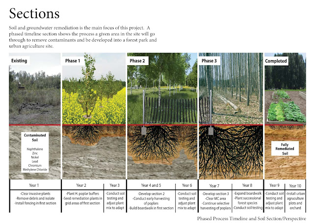 |
| Page 4, 1 of a 2 page spread |
 |
| Page 5, 2 of a 2 page spread |
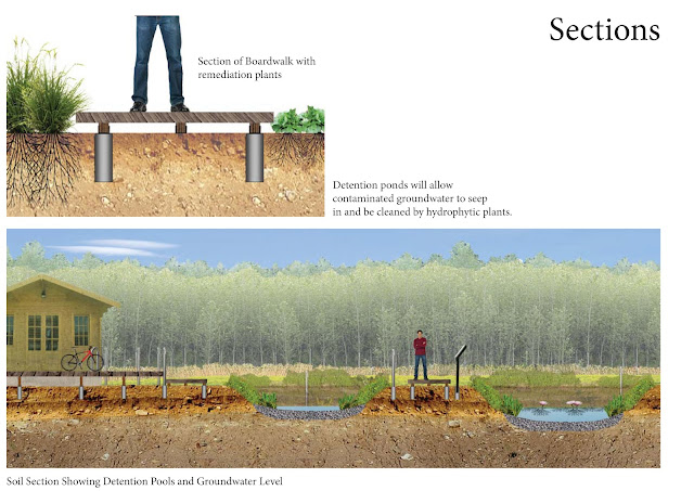
Yay! Sections! Very important for my site, not really because I am looking at land use but because I am dealing with the relationships above and below the surface. One incorporates a timeline for a specific area of the site, the small one deals with a detail, and another looks at a larger area section dealing with detention ponds and groundwater. Same kind of process- photo manipulation in Photoshop, assembly with labels in Illustrator, and on the page in InDesign.
 |
| Page 6, 1 of a 2 page spread |
 |
| Page 7, 2 of a 2 page spread |
 |
| Page 8, 1 of a 1 page spread |
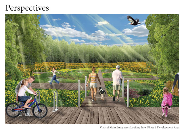
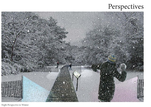
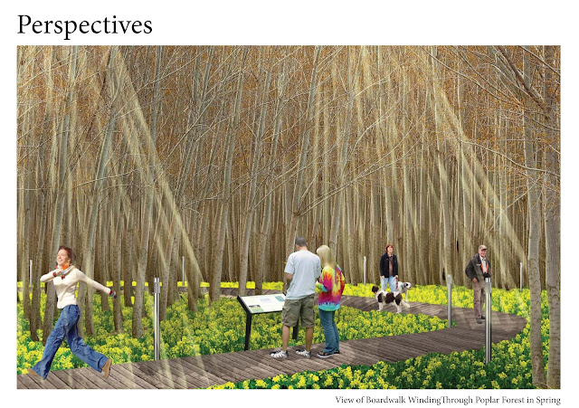
And perhaps my favorite, perspective drawings! These were all put together in Photoshop, lots of fun there, trying to play with light effects but my sunbeams may need some more work. Using real people instead of silhouettes now....


No comments:
Post a Comment