 |
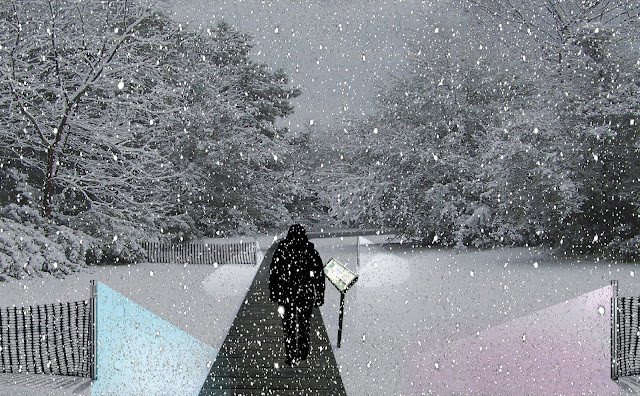
| Perspective with Snow at Night |
This perspective was created by Photoshopping a snow covered treeline over an overcast sky, then the snowline was extended forward to change the perspective angle slightly. Then the elements such as the boardwalk were created out of pictures of textures and materials. shadows were dropped on the snow where needed and the sign and person were added. a layer mask was used to create the darkness and parts were erased and tinted for the lights in the snow. Lastly the snowfall was placed over the whole thing so it was not dimmed by the mask, reflecting ambient light.
 |
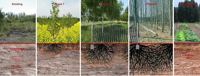
| Section of Phytoremediation Process |
This section shows the phytoremediation process in a selected area of the site. The soil is gradually cleaned in phases by the encroaching roots from the poplar trees and annual plants such as indian mustard and ryegrass, the myco- and bioremediation techniques are not shown here due to the scale, but they are also used in the soil.
This was created by using image overlays of different plants, trees, and materials for the upper layer, and soil cross sections and root patterns for the lower. The contaminated soil areas were greyed out and division lines show the jumps from phase to phase. These and the text were added in Illustrator.
Plan of Site
This plan was created on top of the existing image pulled from Google maps. The trees and plant textures were added to show dominant growth and plant palettes during one of the phases. This was put together in Photoshop.


very strong start Erin! the images are looking great. Some good points were mentioned by your colleagues on Monday, I could echo my own thoughts here.
ReplyDelete1. your perspective is excellent... it's dramatic, haunting, lovely, but it might benefit from shifting the scale figure into play such that he/she would bring the image into a more human scale proportion and so the path could stand out more as a design element. they blend together a bit at the moment.
2. another gorgeous image. You might push the distinctions between the zone farther, in other words try to get the most out of a range of tonal values from one end to the other... the red text is difficult to read as well. try blocking a black or white slab behind the text so it reads better.
3. your plan is interesting, it could benefit from treating the site through more diagrammatic means, instead of seeing each single tree, as you've shown, what would happen if the vegetation was communicated as connected canopies? try making groups of tree symbols and then working with some more vibrant hue saturation and color effects to let the greens sing...