Monday, April 30, 2012
3D modeling
3D modeling using the CRC Router
One project we had worked on for the last couple of weeks is using computer programs to design a 3-dimensional model that would be cut out of a material of our choosing by the CRC Router in the basement. This was a neat project since most of the computer-run modeling machines I was used to using were the laser cutter and one that extrudes a material in layers that becomes an object (sort of like how a printer does). We were able to start with some part of our designs already created for our thesis projects. I wanted to use the wetland pool areas in my project since that area had the most change in topography. I altered the actual design into a more abstracted pattern of that area, sort of like an art piece.
I started with laying out the design in AutoCAD since I was using a series of the same shapes in a pattern, and changing how contours in certain areas would change.
From there I took the file into SketchUp and turned the 2D image into a 3D model (lots of fun, try it if you have access to the programs).
After that, with great thanks to Josh, Simon, and Zach, it was turned into a code that the router would understand and I booked a time on the machine.
I chose to use plywood to show the contours of my model. and since the smallest bit was about 1/4 inch I had to make my model larger so the smallest cut was at that size. I did not want to accidentally cut into the table so I ended up laminating 4 layers of 3/4 ply together.
Cutting was fun, took a while though since the model ended up at 2'x3' and much of the first layer was chewed away.
After this the surface is sanded a bit smoother, however the small finishing bit did give it a nice texture. I do like the odd notching on the diagonal lines, it might have been nice to stop the finishing bit half-way through to show the texture left by the first bit as it was neat in a sculptural sense. A resin or transparent liquid can be used to represent water in the depressions, whether I would want to include other materials for plant materials or something similar is another matter. I like being able to see the layers though.
Friday, March 2, 2012
Exercise 4
Welcome to the 4th phase of this assignment!
For this part we had to put together a "portfolio" of the images we have worked on so far using a combination of the different computer programs we have looked at in class.
Ok, to set up the project and quickly introduce the important processes behind what I am working on the site: three of the biological remediation techniques. This page was organized in InDesign, but the individual diagrams were hand drawn, assembled in Photoshop, and then the arrows shapes and text were added in Illustrator.
The second page/spread deals with a site inventory and exploded axon depicting specific elements in and around the site. Using SketchUp I created a topo map off of an areal image imported from Google Earth (really cool process by the way) and extracted and saved just the contour lines that were projected onto the map. I wish I knew this back when I was hand tracing/drawing a contour map in Autocad for hours. The contour map and areal were pulled into photoshop and touched up for better quality images. These were then opened in Illustrator and the rest of the layers were drawn on top of them. Make an exploded axon diagram and you have an image that is just way cooler than a flat series of diagrams. Once again they were pulled together and labeled in InDesign.
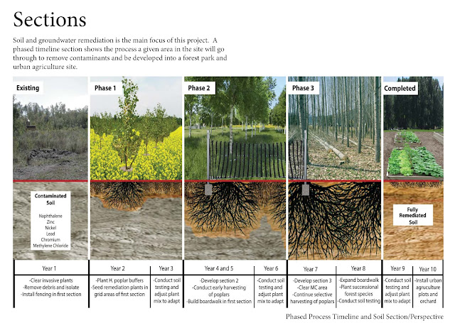
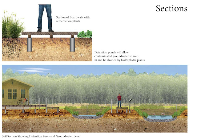
Yay! Sections! Very important for my site, not really because I am looking at land use but because I am dealing with the relationships above and below the surface. One incorporates a timeline for a specific area of the site, the small one deals with a detail, and another looks at a larger area section dealing with detention ponds and groundwater. Same kind of process- photo manipulation in Photoshop, assembly with labels in Illustrator, and on the page in InDesign.
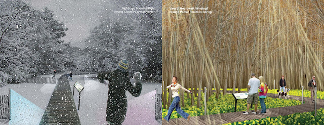
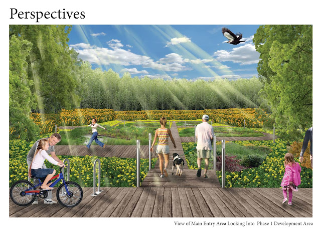
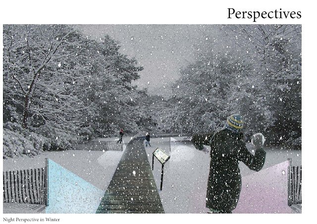
And perhaps my favorite, perspective drawings! These were all put together in Photoshop, lots of fun there, trying to play with light effects but my sunbeams may need some more work. Using real people instead of silhouettes now....
For this part we had to put together a "portfolio" of the images we have worked on so far using a combination of the different computer programs we have looked at in class.
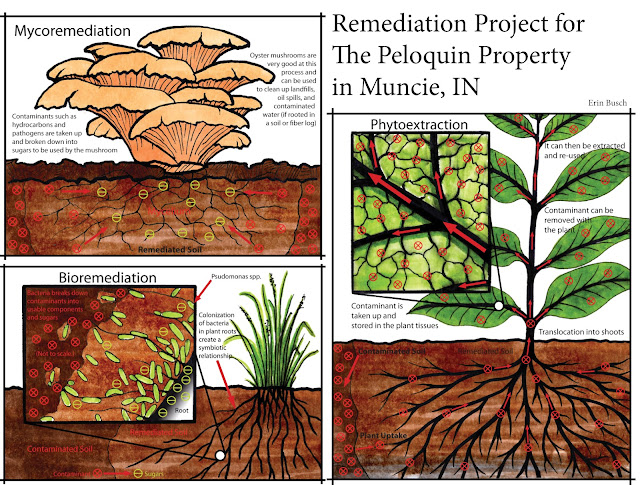 |
| Cover/First Page |
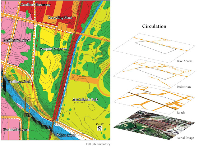 |
| Page 2, 1 of a 2 page spread |
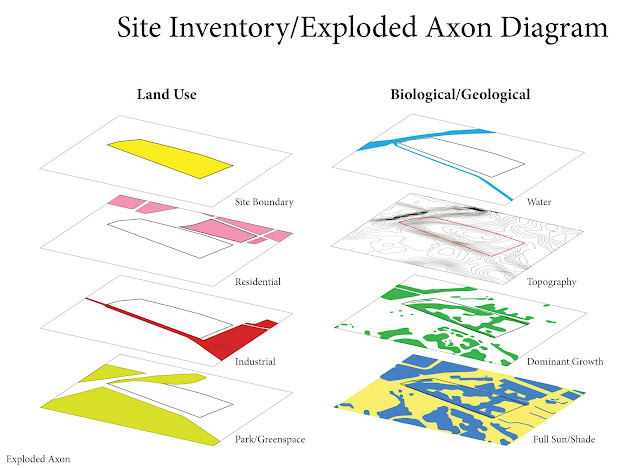 |
| Page 3, 2 of a 2 page spread |
The second page/spread deals with a site inventory and exploded axon depicting specific elements in and around the site. Using SketchUp I created a topo map off of an areal image imported from Google Earth (really cool process by the way) and extracted and saved just the contour lines that were projected onto the map. I wish I knew this back when I was hand tracing/drawing a contour map in Autocad for hours. The contour map and areal were pulled into photoshop and touched up for better quality images. These were then opened in Illustrator and the rest of the layers were drawn on top of them. Make an exploded axon diagram and you have an image that is just way cooler than a flat series of diagrams. Once again they were pulled together and labeled in InDesign.
 |
| Page 4, 1 of a 2 page spread |
 |
| Page 5, 2 of a 2 page spread |
 |
| Page 6, 1 of a 2 page spread |
 |
| Page 7, 2 of a 2 page spread |
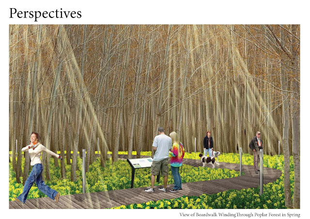 |
| Page 8, 1 of a 1 page spread |
Monday, February 13, 2012
Exercise 3
 |
| Perspective with Snow at Night |
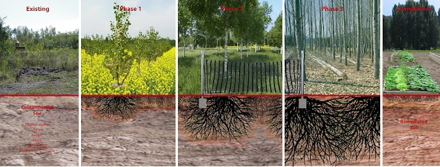 |
| Section of Phytoremediation Process |
This was created by using image overlays of different plants, trees, and materials for the upper layer, and soil cross sections and root patterns for the lower. The contaminated soil areas were greyed out and division lines show the jumps from phase to phase. These and the text were added in Illustrator.
Plan of Site
This plan was created on top of the existing image pulled from Google maps. The trees and plant textures were added to show dominant growth and plant palettes during one of the phases. This was put together in Photoshop.
Sunday, January 29, 2012
Exercise 2: Concept to conception in public space
Schiebroek-Zuid
Project Greens; Rotterdam, Netherlands; Except
Consult
 | |
| View of Central Markets |
The design process:
 |
http://www.except.nl/design/Schiebroek-Zuid/index.html
|
Options for a closed-loop system dealing with energy, food, and water needs were considered and matched to the particulars of the site conditions. This project is hoped to influence future urban renewal designs in the light of our changing environmental issues.
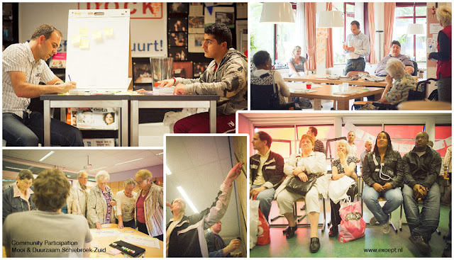
The next step in the process for this project was a community charrette held to get the impression of the people living in the area. This part of the process involved both the stakeholders and residents and was commissioned by Vestia (housing corporation), and InnovatieNetwerk (agricultural non-governmental organization). This step is very important since the project is centered around what the community needs and wants for public space, so discussions and open concept drawing sessions added valuable input.
Ignoring the fact that the text in the images are in Dutch, these have been compiled by the design group in response to the community charrette. At this point the designers were able to find out what was important and could refine them down to a working program or list of needed elements.Future projection, system flow diagrams, and conceptualization:
From the concept sketches and program a set of goals was drawn up and diagrams looking at how they could be achieved through different processes. This trajectory diagram is looking at how past energy uses and fuel price and availability can be used to project into the future, showing a point where they merge and balance out showing how the community can become self-sufficient.
 |
| Symbiosis in Development |
By using Symbiosis in Development (SiD) process in their design and
planning, the group can address this complex and multi-faceted problem to come
up with a holistic system solution. This
effort created a kit-of-parts that can be mixed and matched to solve any set of
problems or needs over time to achieve design goals. Since this addresses ecological, social, and
political problems from a multitude of angles and approaches including “green” solutions
that have been proven effective, they are able to make feasible long term
projections and planning design goals.
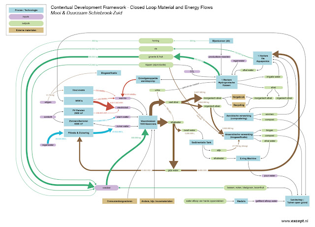
The materials and energy flow diagram helps to illustrate how everything would work in the site. Everything is considered and they attempt to limit the amount of inputs and outputs of materials on site. Social programs designed for people of many backgrounds and ages, primarily ones currently found in the community, and other local business and activity incentives. Solar energy, passive heat capture, biogass systems, edible landscaping, water systems, and the re-use of the existing buildings to limit the amount of ecological and human disruption. The new structures will be incorporated with the standing buildings where they would work best.
Other diagrams include system diagrams such as this water flow diagram focusing on recovery and re-use,
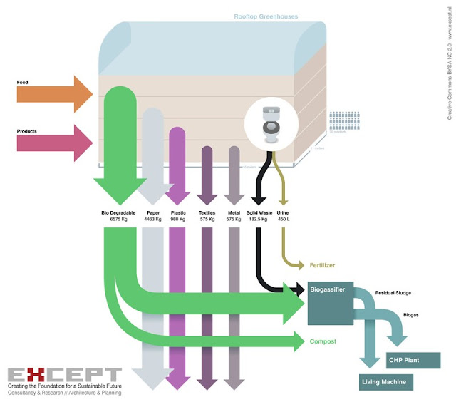 and a waste flow diagram depicting the input and output cycles, focusing on minimizing outsourced waste.
Proposed Master Plan
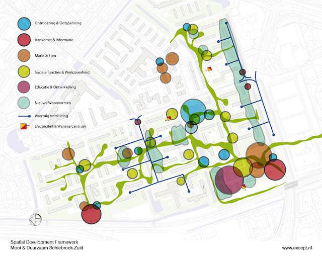
This master design plan shows where residential areas, the marketplace, community center, and flexible workshops are within the site. Since communication and flow through the site are important, public green spaces connects the existing homes and the elements within the design program. Expanses of previously unused lawns are replaced with edible landscaping (potentially up to 70% of needed food production) and residential public space.
Many parts of this design are currently being implemented by the contractor and the design images certainly gives a cohesive, not futuristic per-say (more utopian), but an efficient and self-contained impression. It looks like a close cooperation and co-habitation of humans and the systems they need to be self-sufficient.
Proposed views and site uses: (http://www.except.nl/design/Schiebroek-Zuid/index.html)
 |
| View of Water Park |
 |
| View of Pedestrian Corridor |
 |
| View of Metro Plaza |
 |
| Another View of Water Park |
 |
| View of Water Houses |
Friday, January 27, 2012
Exercise 1 reflections
Subscribe to:
Comments (Atom)


.jpg)


